Brand experience / The Square / 2026
THE SQUARIUM.
Behind the scenes
A creative journey from concept to experience — following an idea as it became an identity, a family of characters and a real place to pause, learn and look closer.
Open the sketchbook
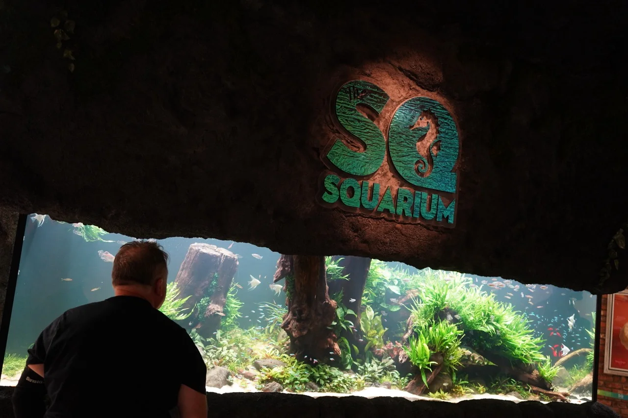
01 / the vision
An aquarium needed more than a logo.
The SQuarium was imagined as a nature-inspired retreat and sensory wellbeing space inside The Square — an underwater world designed to inspire wonder, encourage learning and offer a calm, shared experience for every age.
The creative challenge was to give that experience one coherent voice across identity, characters, motion, web, print and the physical environment, without losing the calmness of the real aquarium at its centre.
02 / the creative process
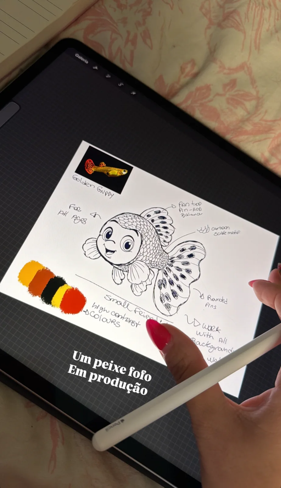
Research. Sketch. Question. Repeat.
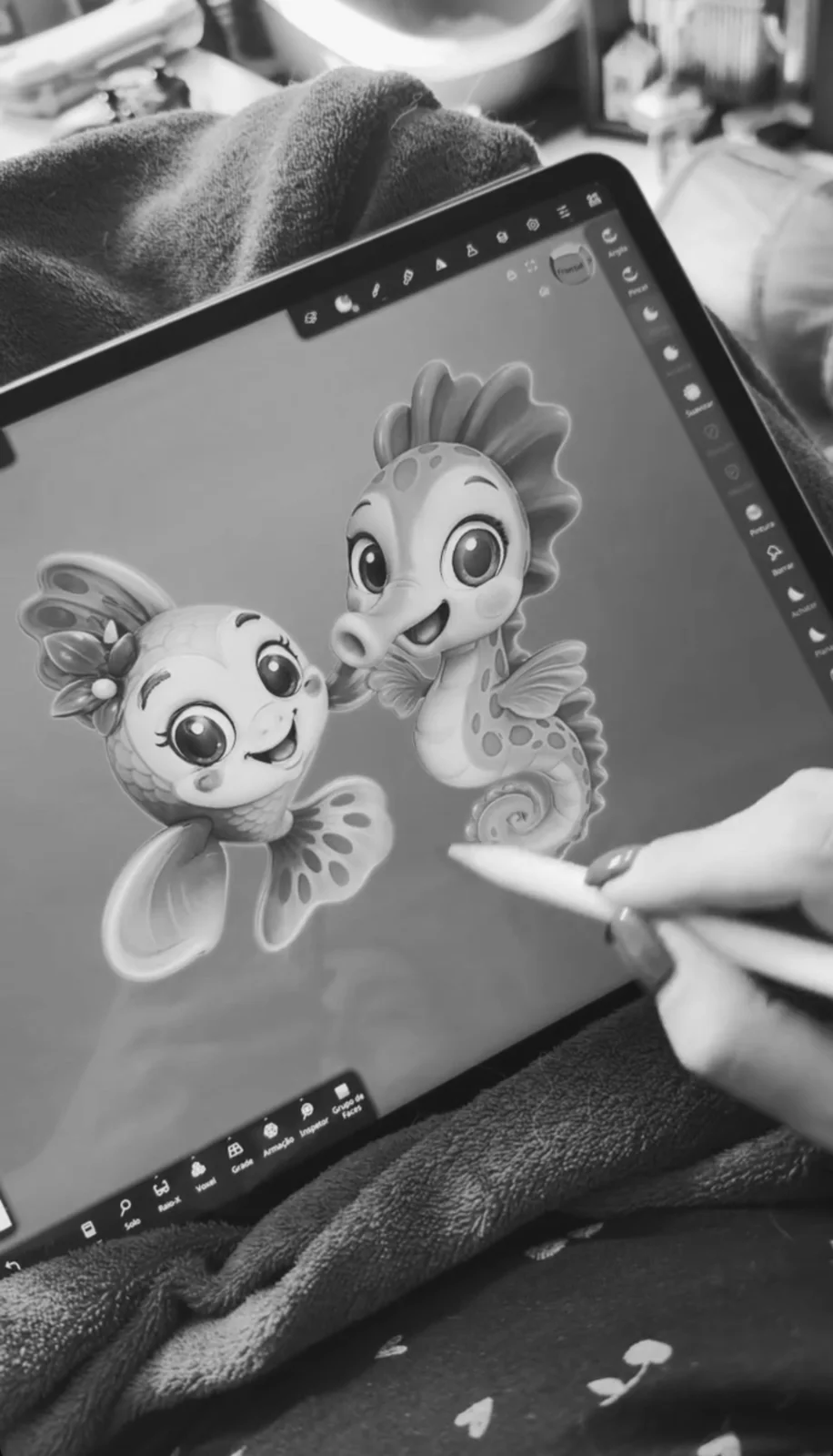
Species references, shape studies and early visual routes sat side by side while the project found its own personality.
03 / building the identity
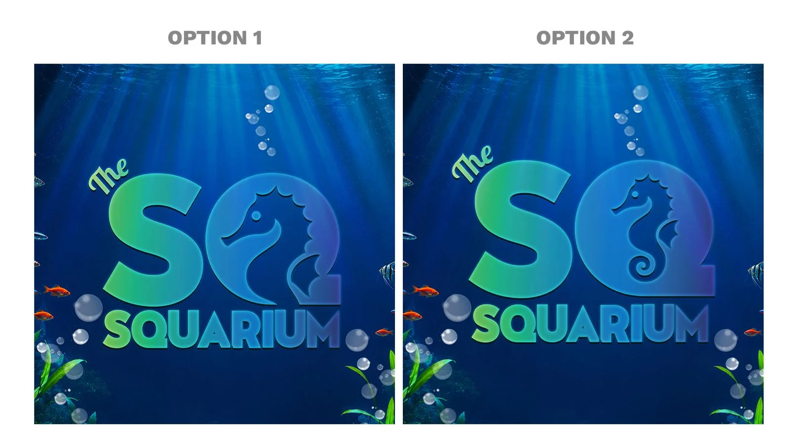
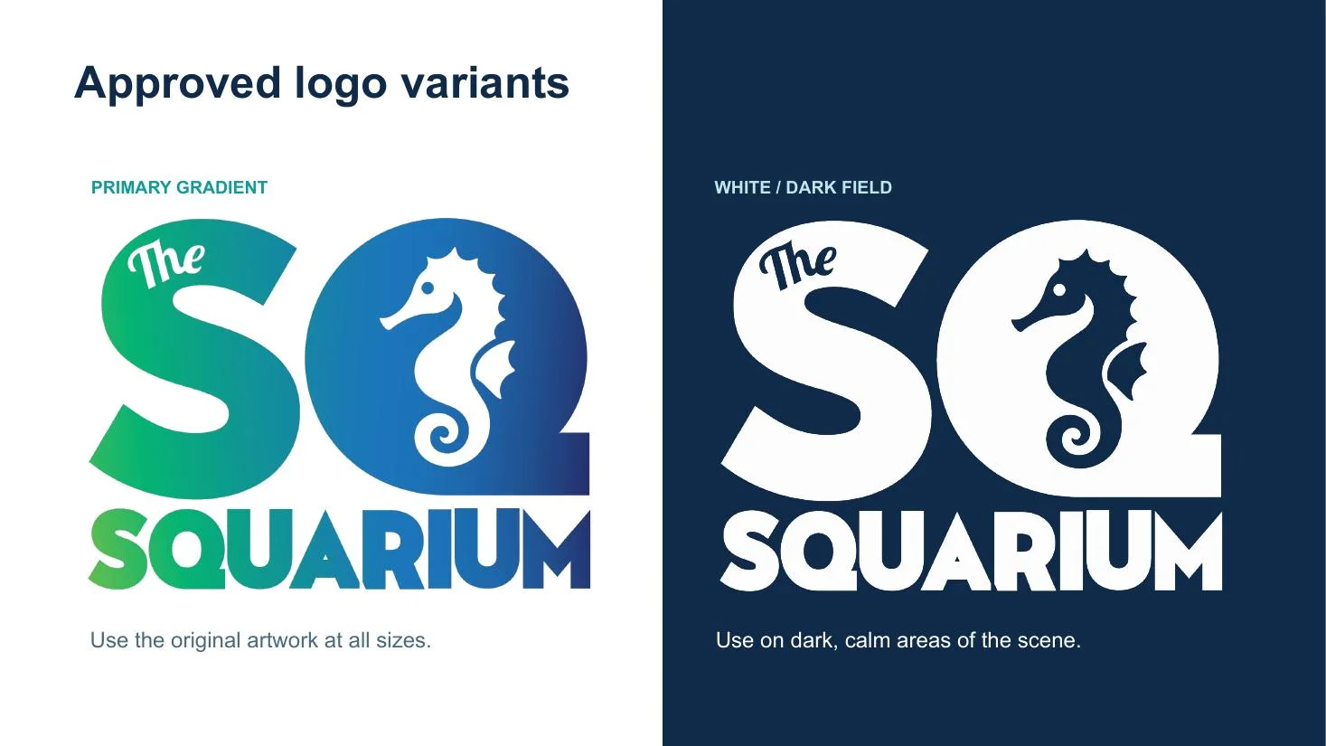
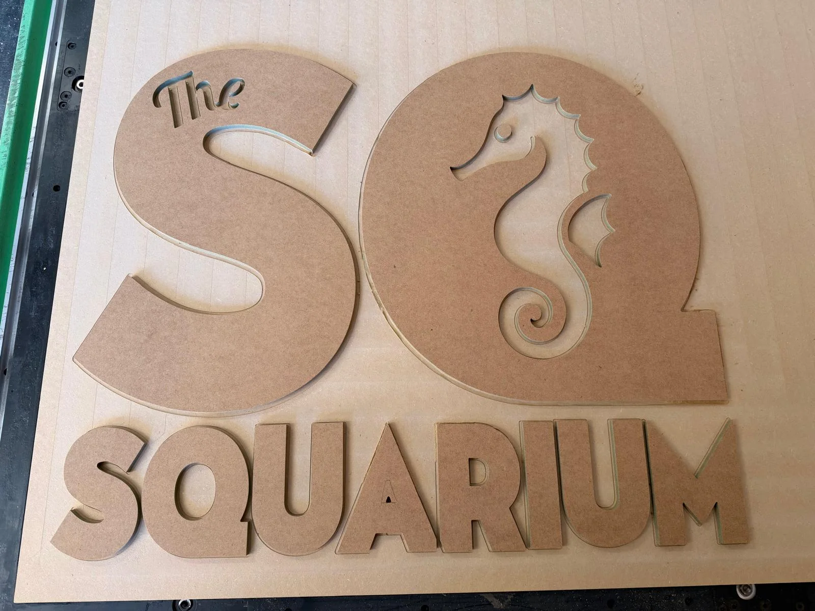
The seahorse found a home inside the Q.
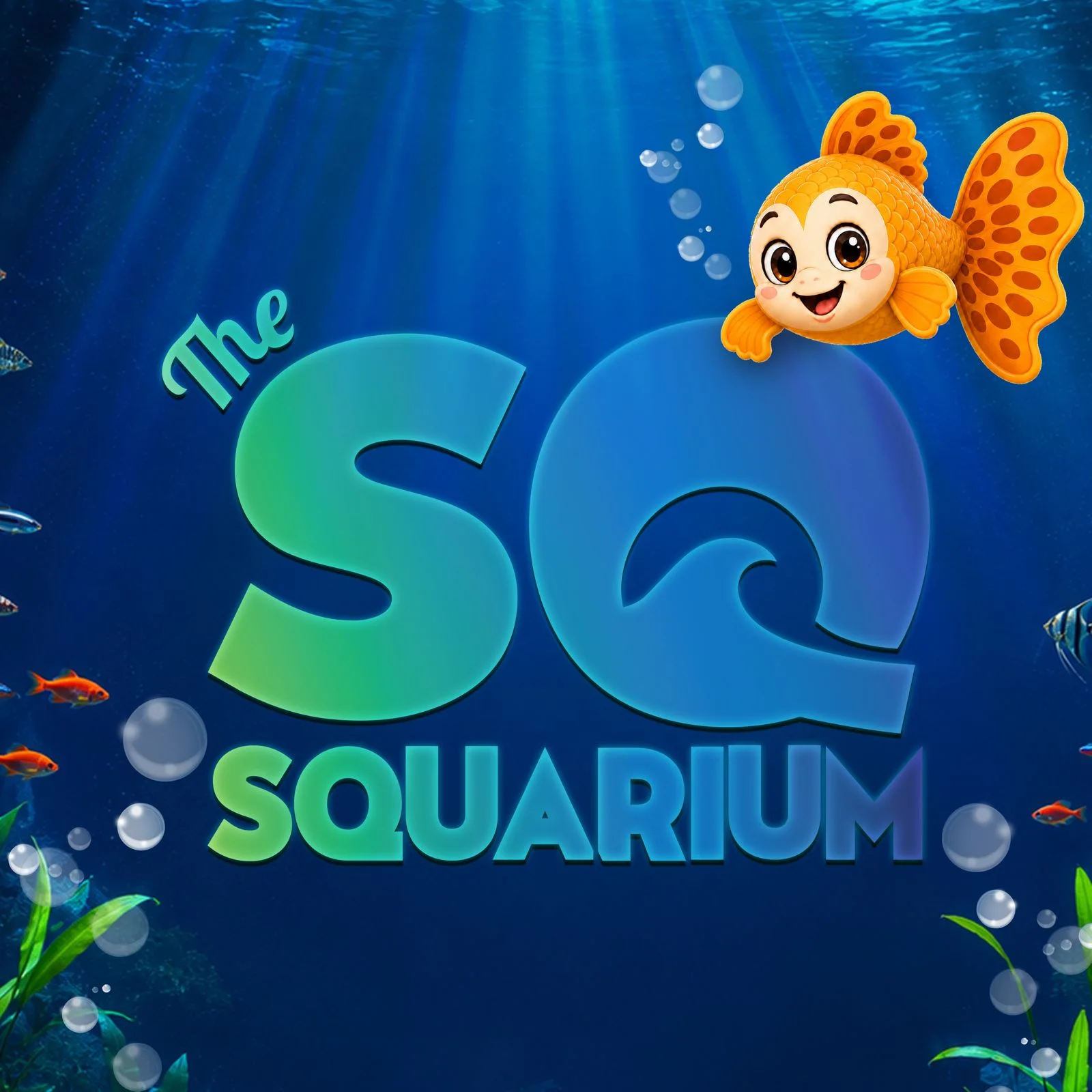
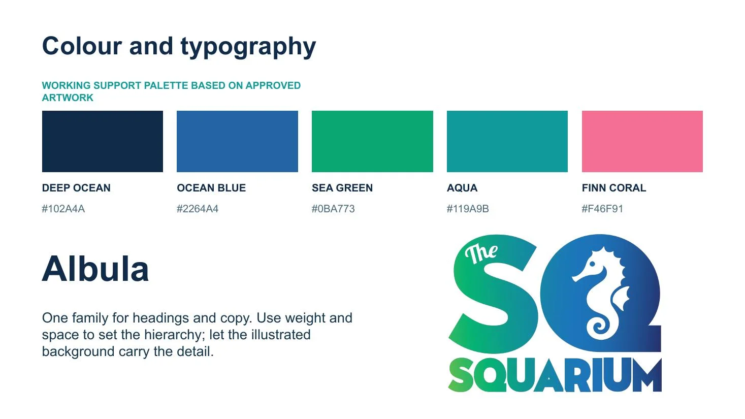
A compact lock-up connected the name to the underwater experience, with a sea-green to ocean-blue gradient and a clear silhouette that could move from screens to signage and fabrication.
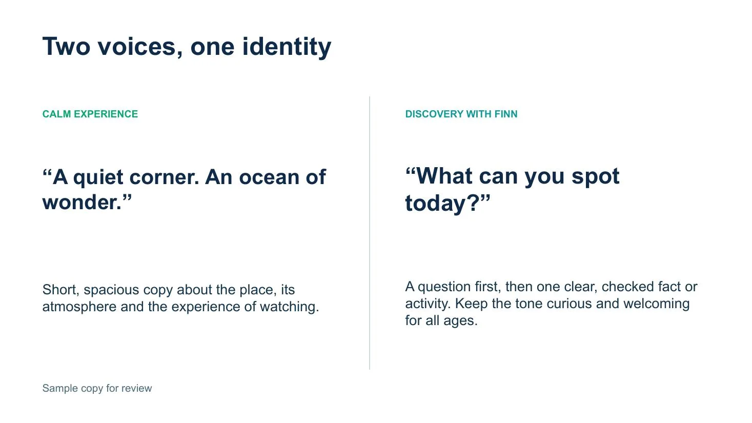
a system flexible enough for calm moments and playful discovery ✎
04 / character lab
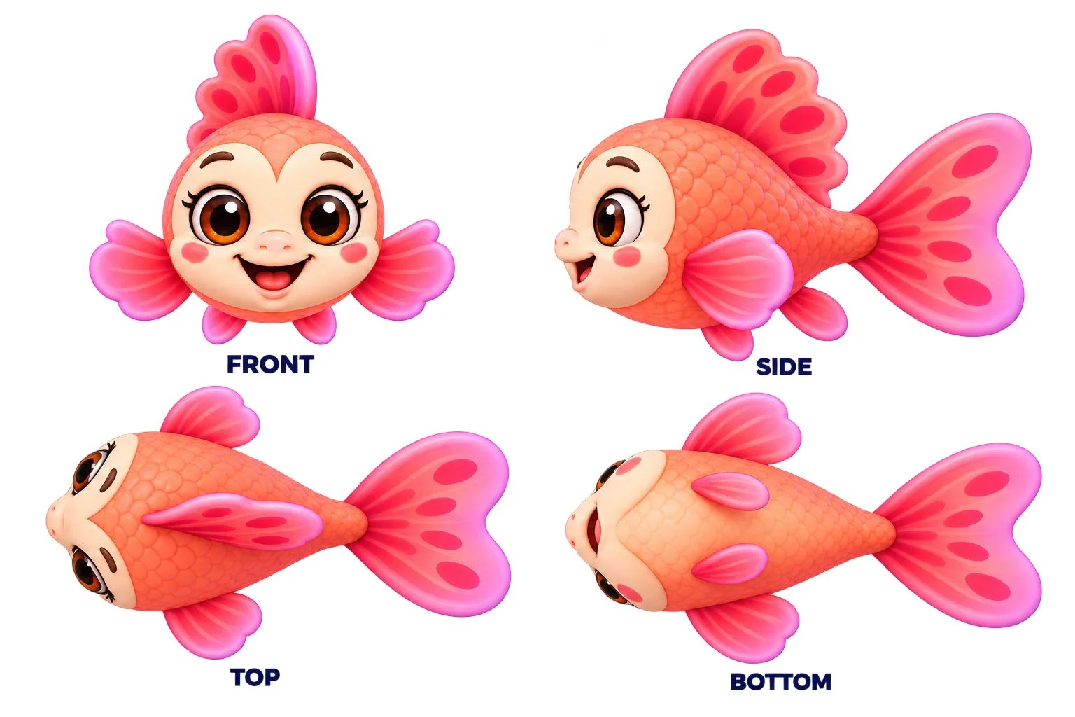
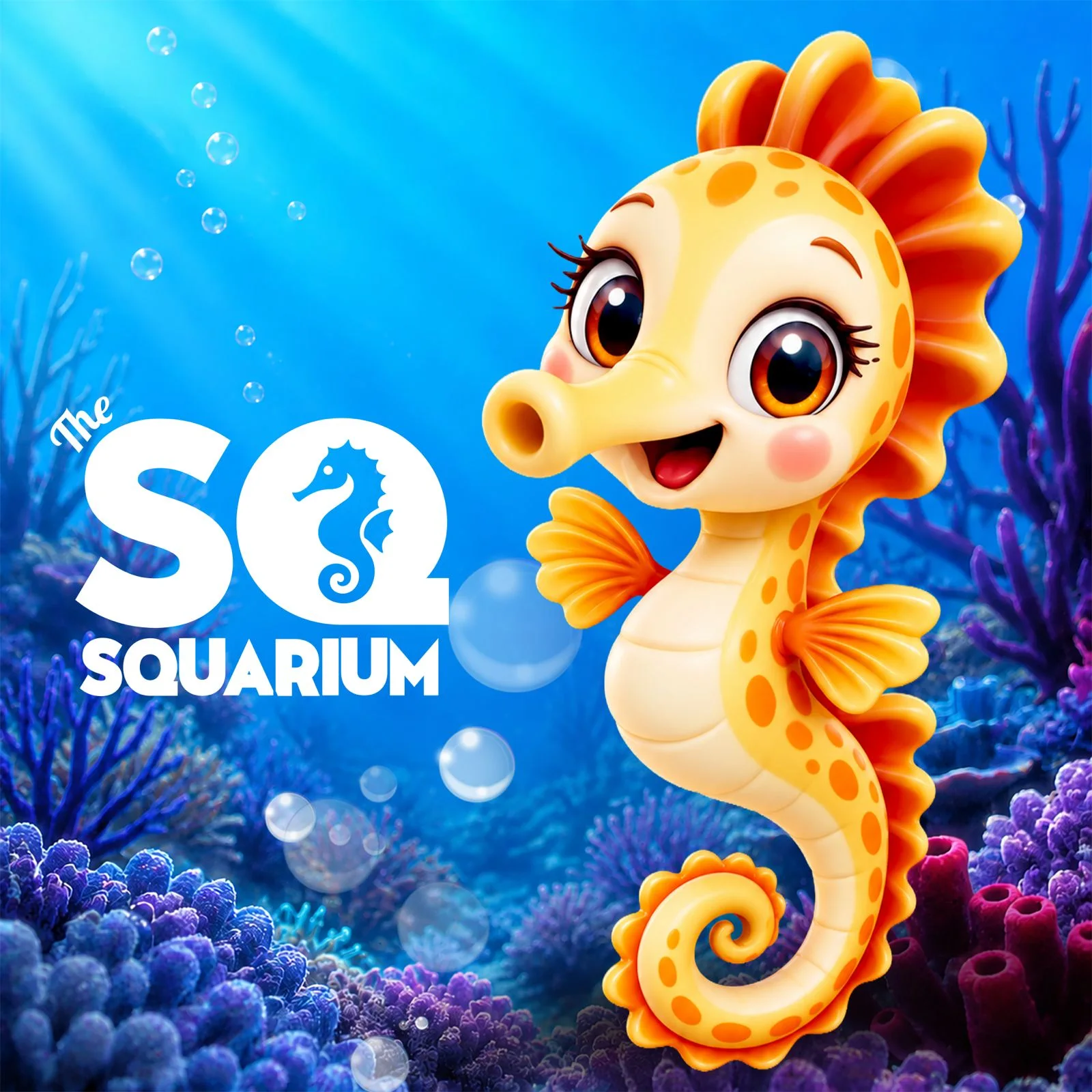
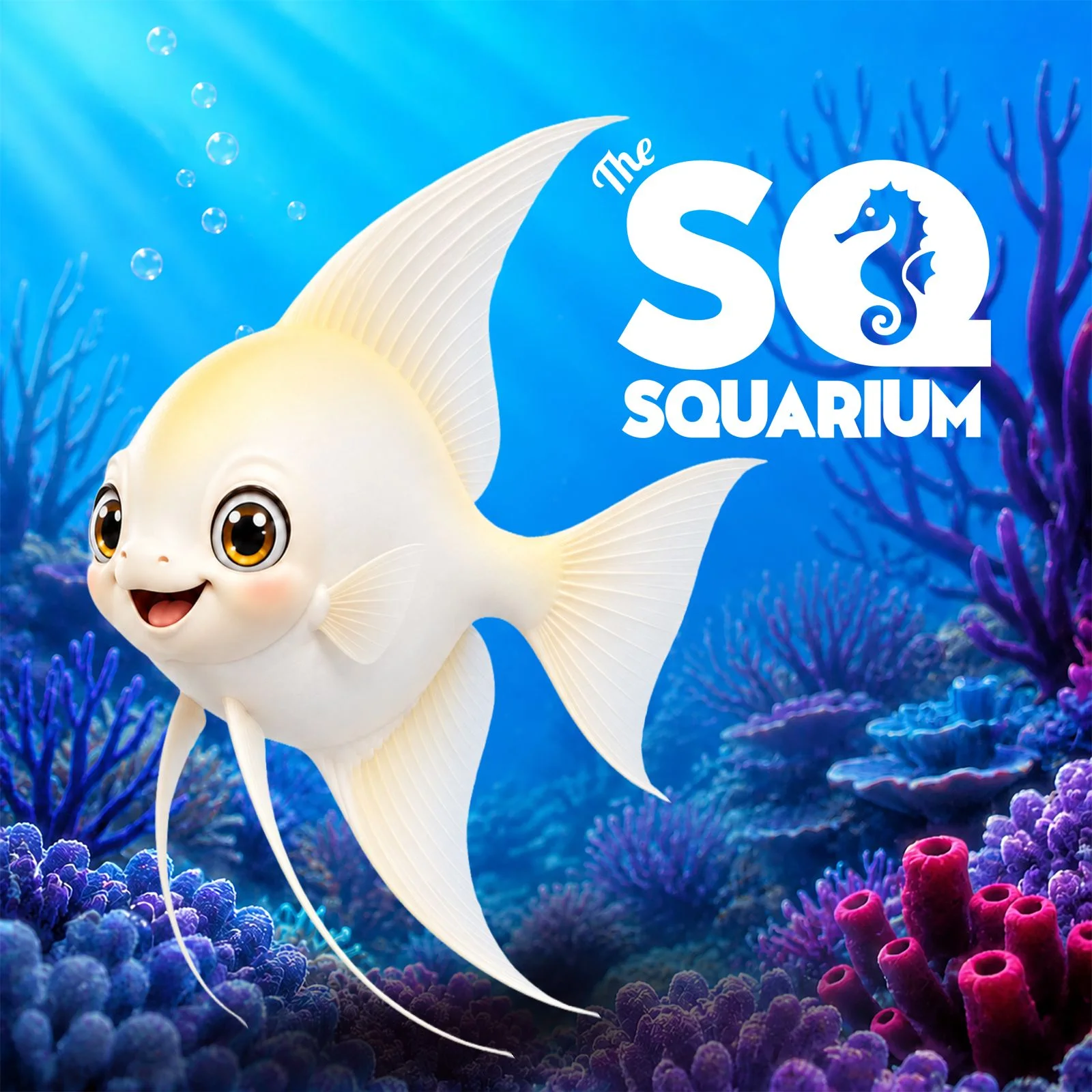
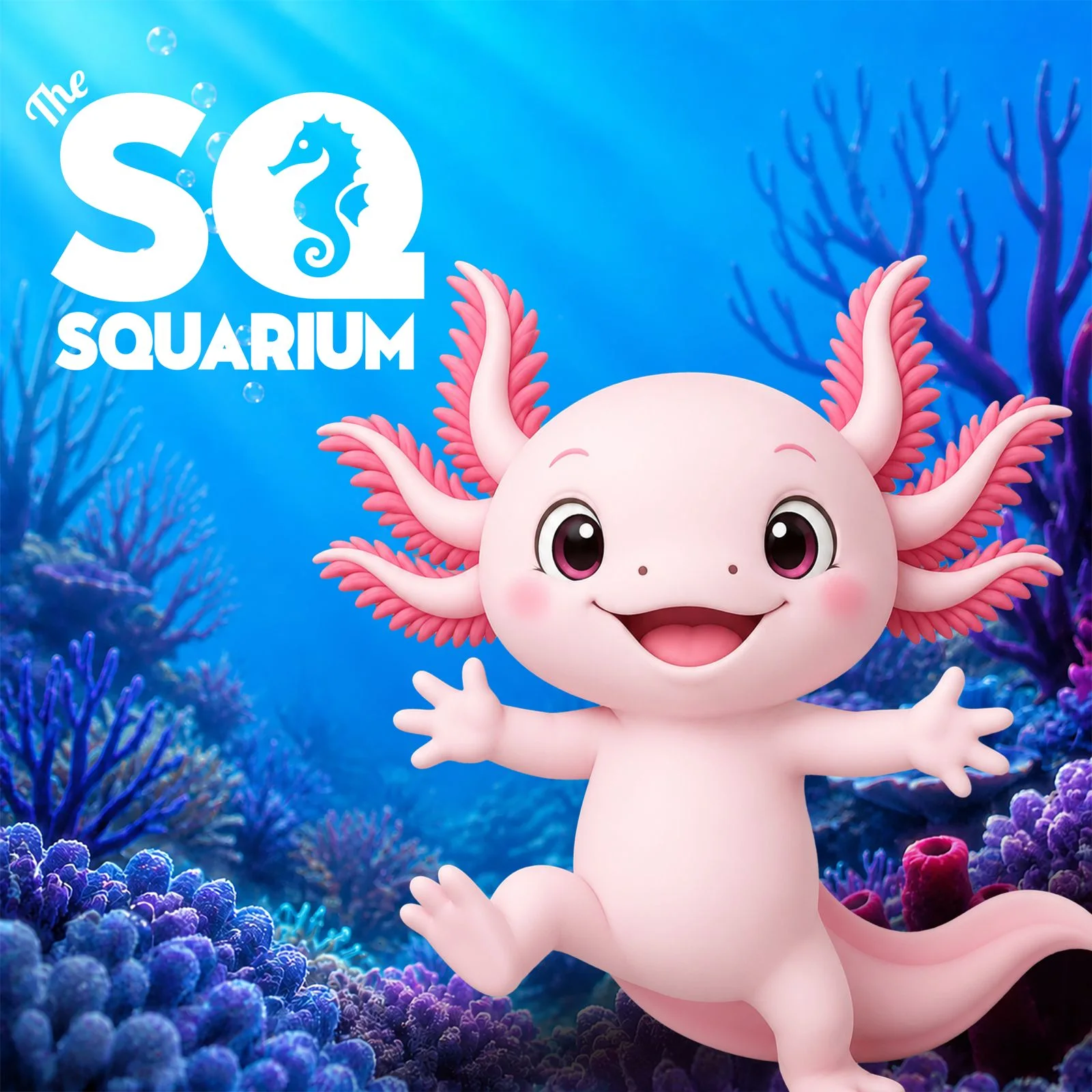
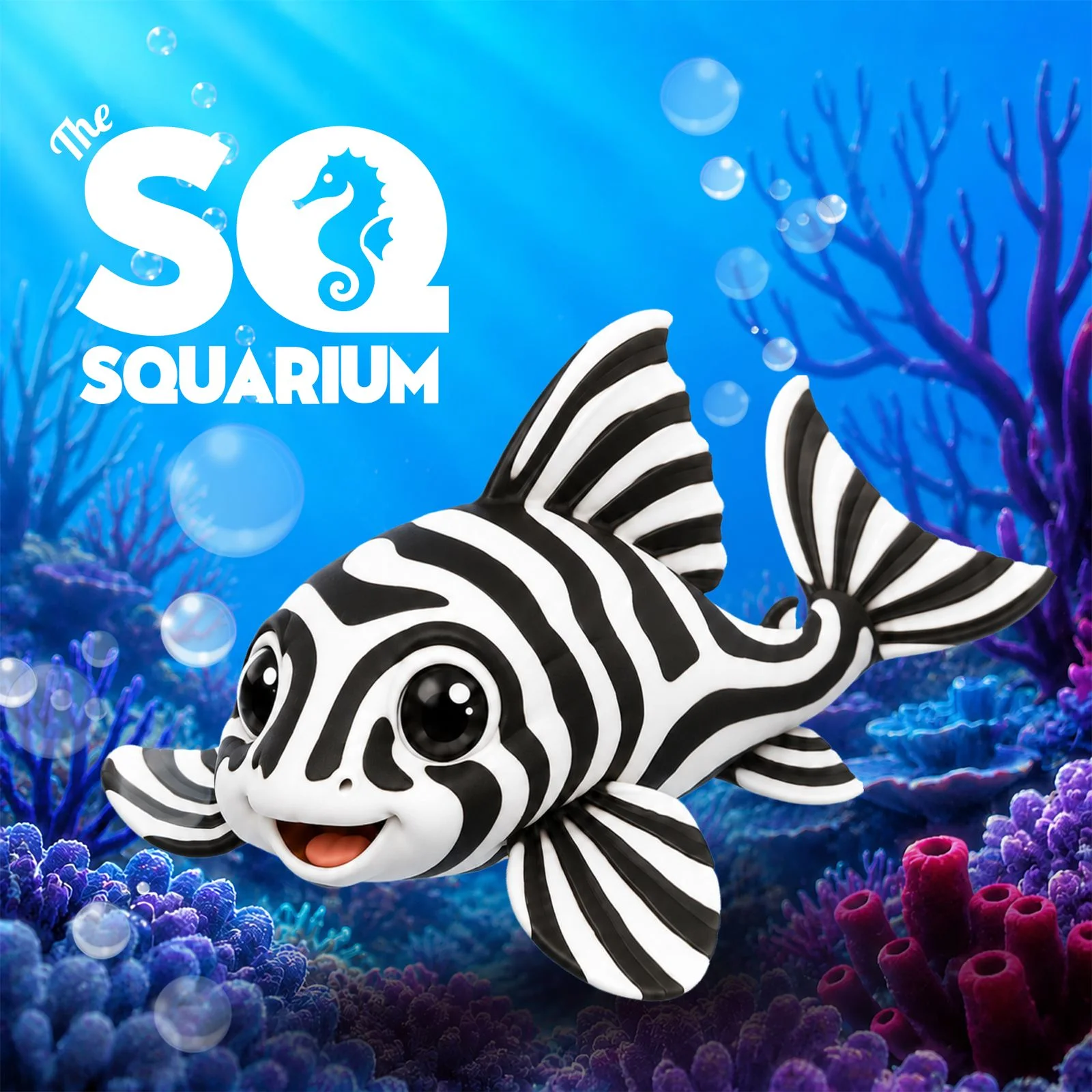
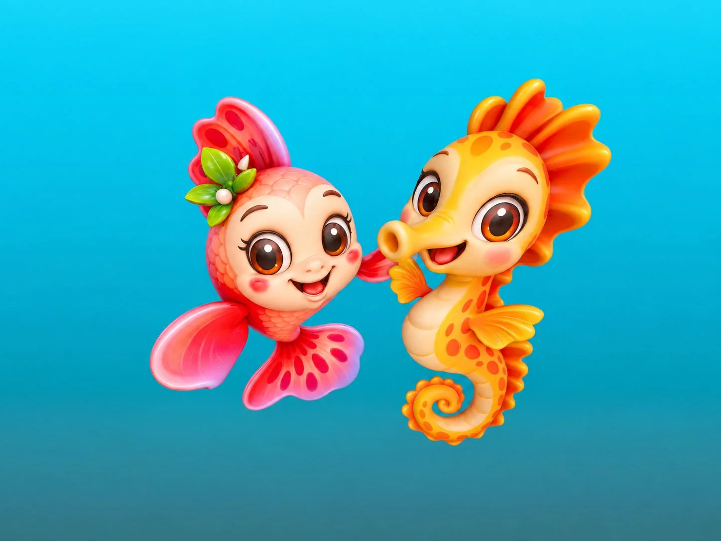
Seven mascots. One underwater family.
The character line-up explored different species, silhouettes and personalities. This selection of development artwork shows how the family moved from individual studies towards one shared visual world.
05 / from Fiin to Finn
A name, a language and a little pink plot twist.
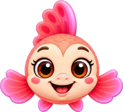
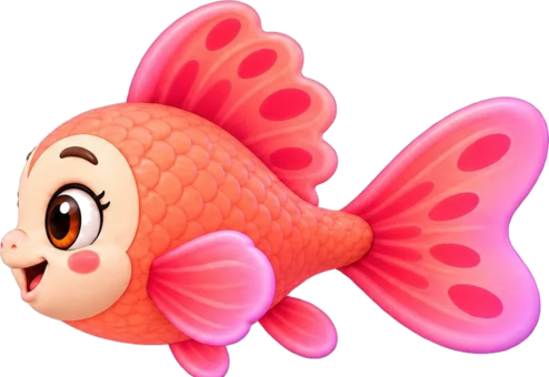
One of the ideas behind the early name came from the Portuguese word fino. Everyone naturally assumed Finn referred to a fish's fin — which worked perfectly too. But the unofficial version inside my head? She was simply a very slim little fish. Entirely my decision. Please don't tell anyone. As the character evolved, the spelling became simpler and the yellow fish developed into Finn, a joyful female pink Betta and the guide for playful discovery.
officially: wordplay · secretly: she was magrinha 🤫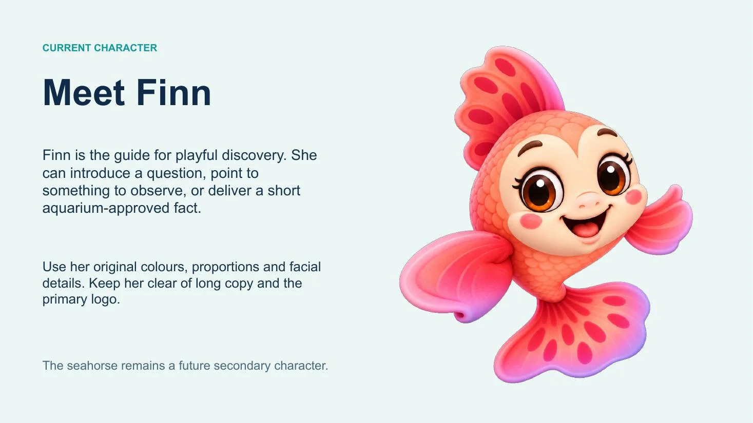
06 / bringing it to life
One idea, many surfaces.
The identity expanded into animation, the website, launch artwork, information graphics, printed pieces and production-ready signage.

Motion studies / 15-second loops
The characters learned to move.
Short motion pieces carried the identity onto The Square's digital screens — giving the seahorse a dramatic entrance and introducing Finn as the friendly face of the experience.
from character sheet to screen time ↗Website / The Square
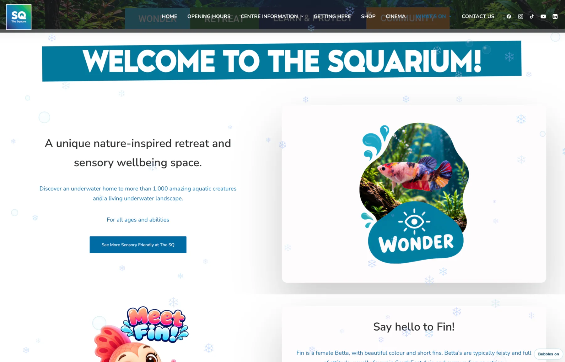
The story continued online.
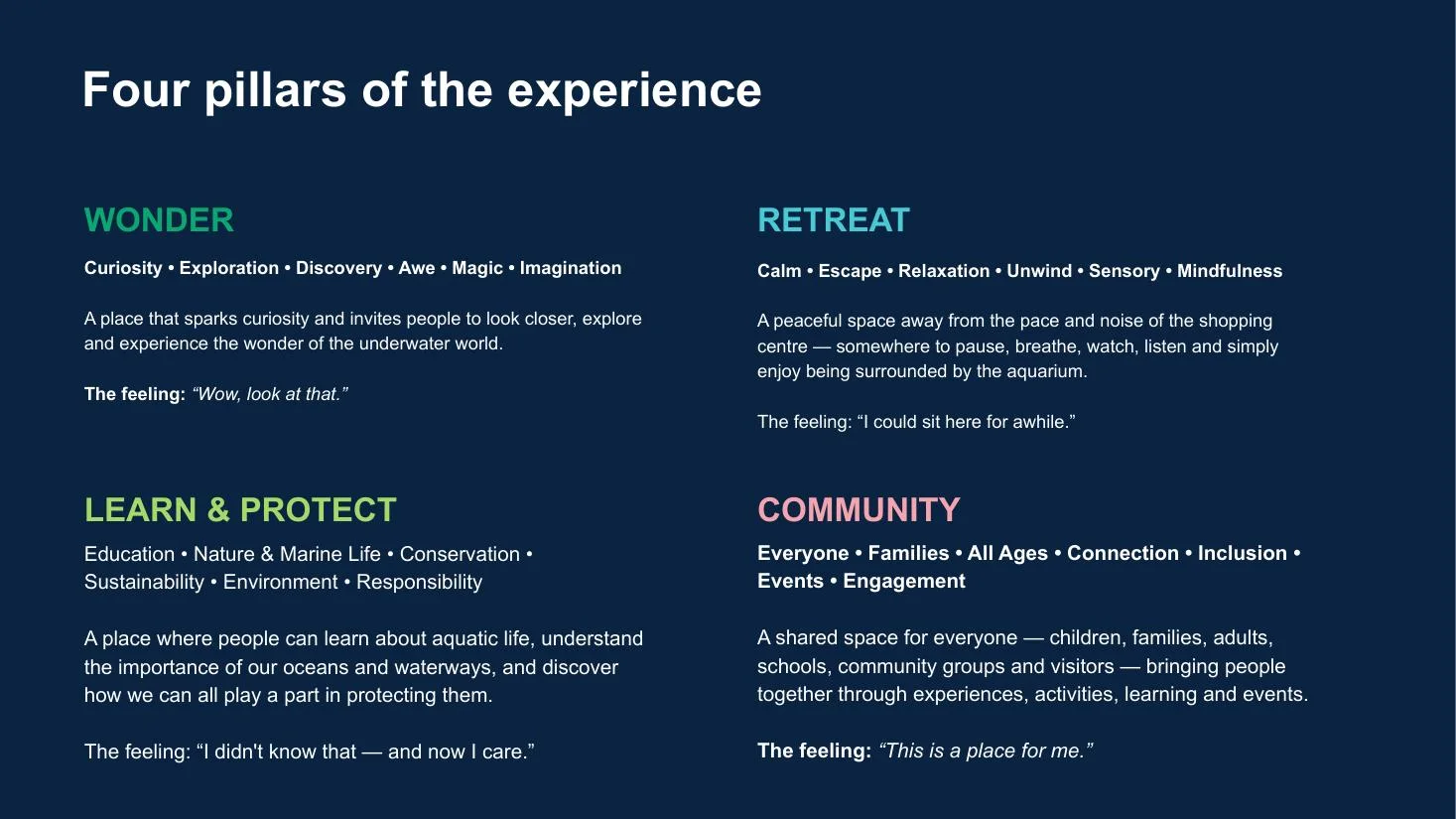
The SQuarium page brought the identity, visitor information and playful education into one digital journey — from the four experience pillars to Finn Facts, sensory wellbeing and community visits.
bubbles on / bubbles off — tiny detail, big difference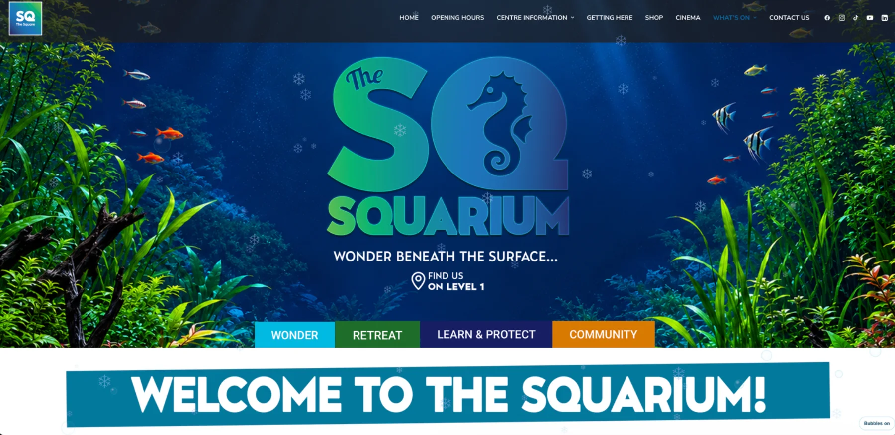
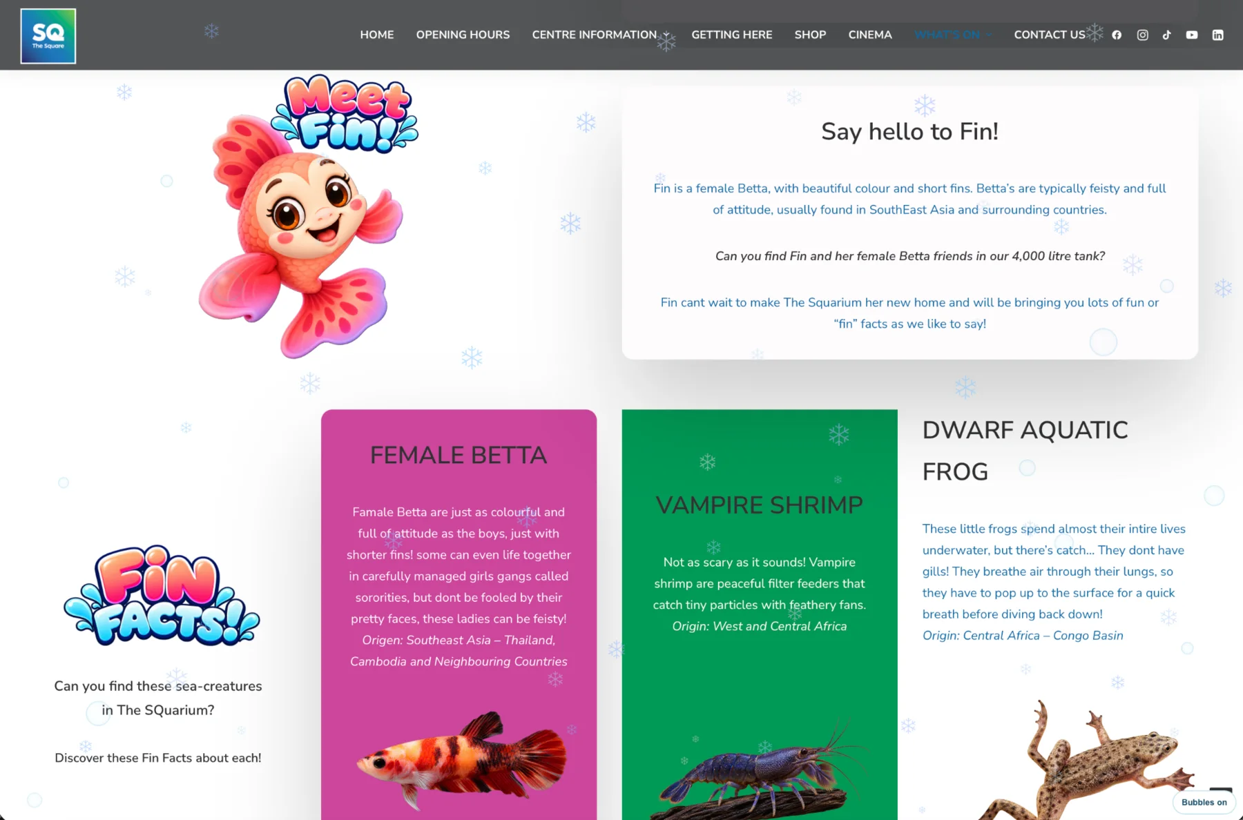
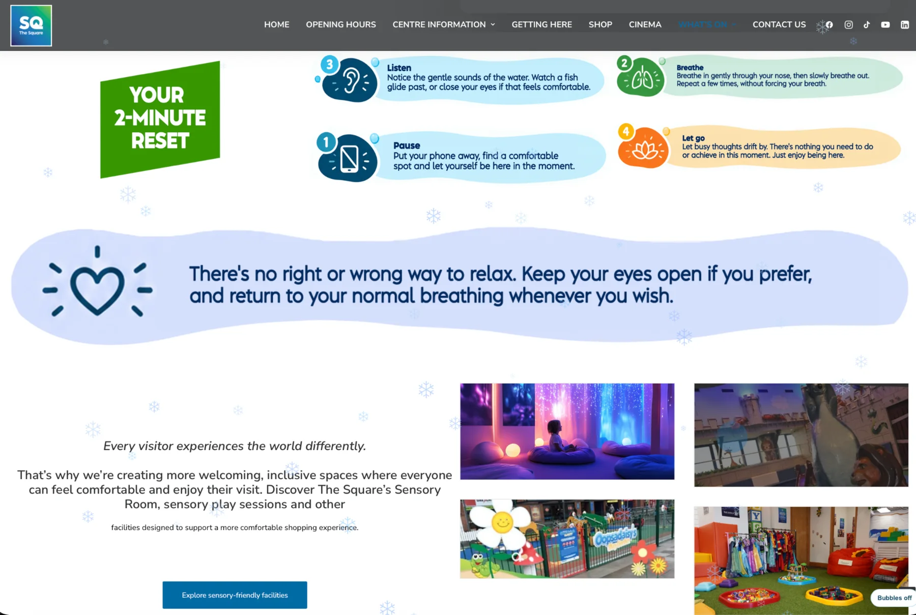
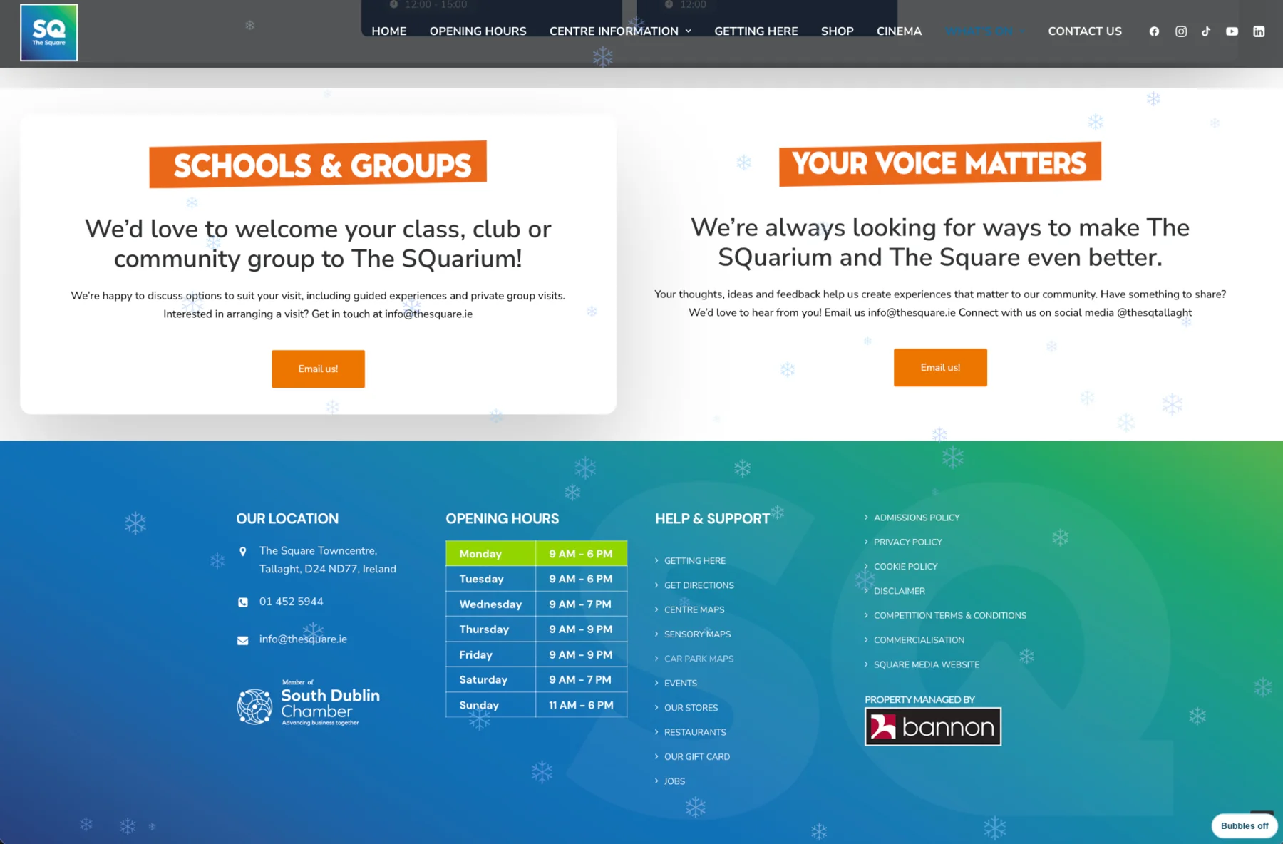
07 / the final experience
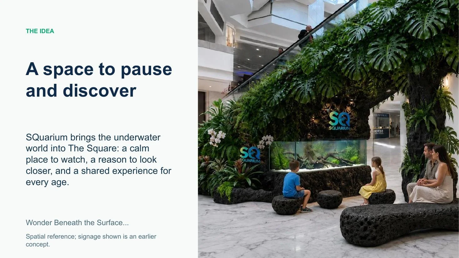
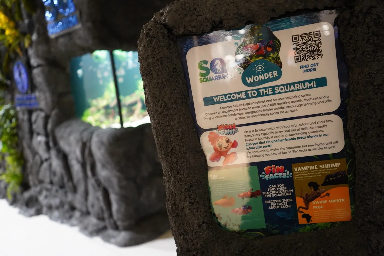
Then the sketchbook became a place.
At The Square, the work moved into the real environment — around the aquarium, on information points and across the visitor journey.
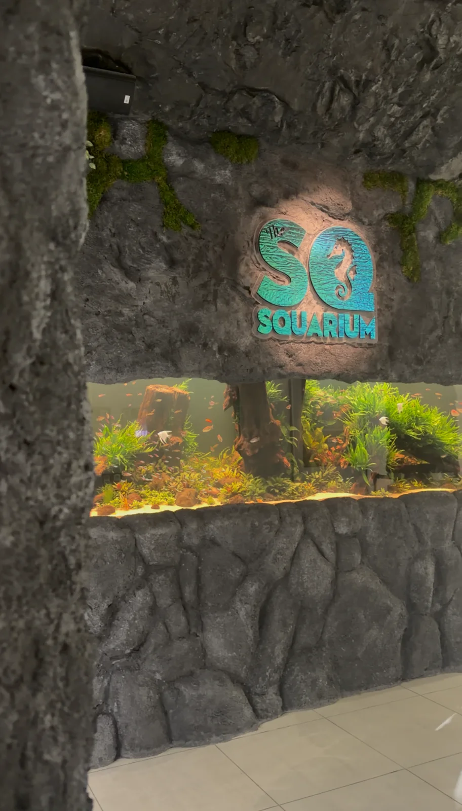
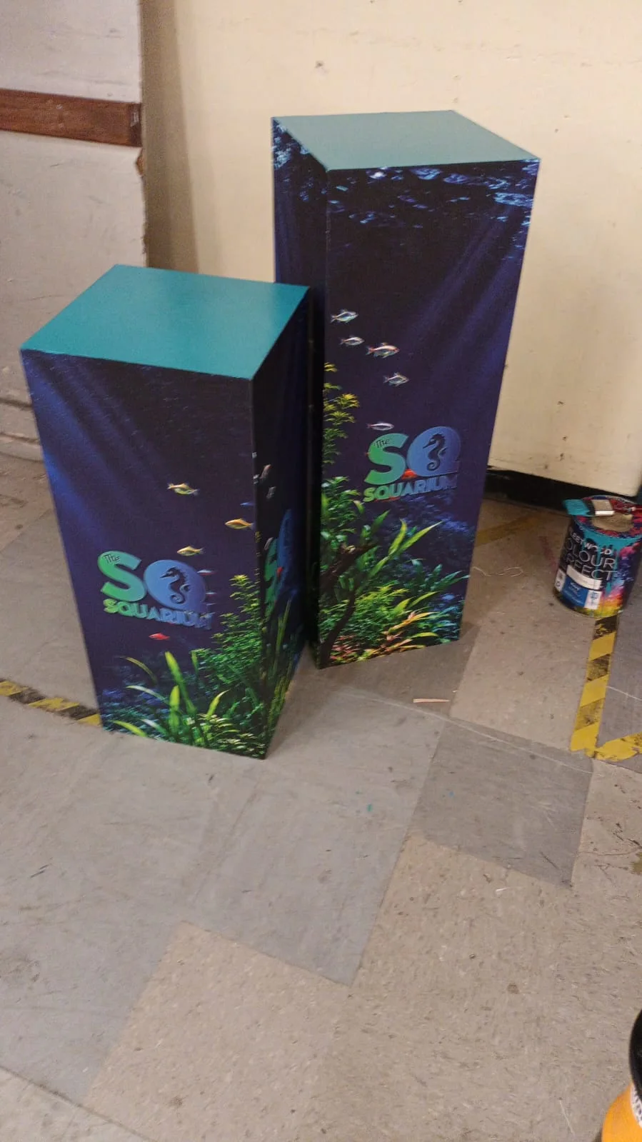
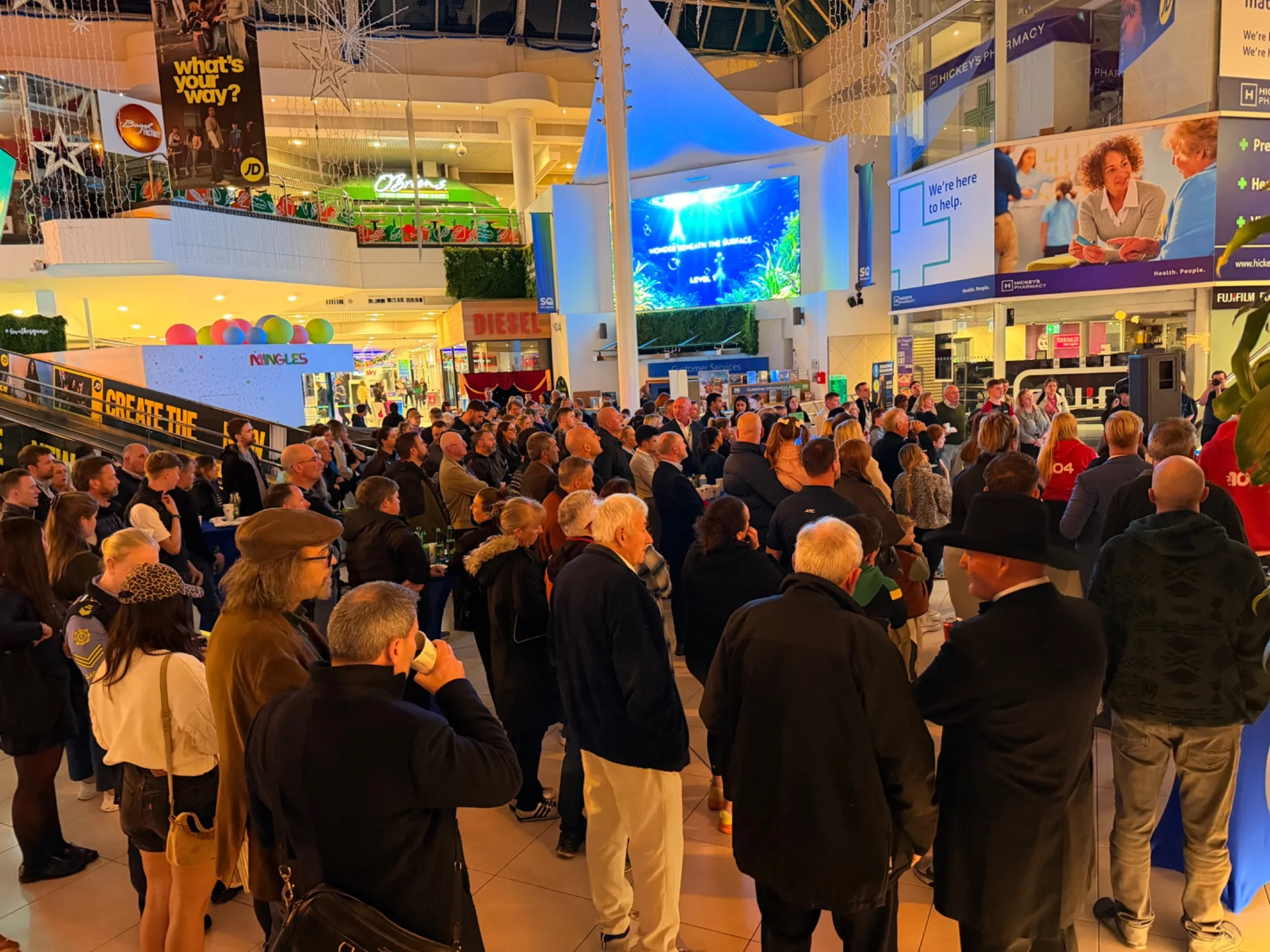
A real opening night
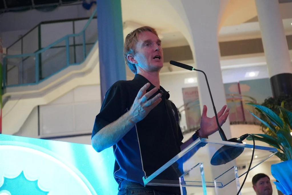
And Jack and Kealan had something to say.
The launch brought the identity, the physical experience and the screen content together in front of a live audience. Jack and Kealan — two of the key people behind the project — each became part of that joyful opening moment.
press play for Jack's big speech ↓08 / more than just fish
A lesson in looking closer.
In the middle of fast-paced creative work, this project taught me something quieter: to breathe, notice the details and look beyond “it's just fish”.
Watching an aquarium is almost a philosophy of life. Even when the space around it is chaotic, there is another world waiting for you to stop and pay attention — to the light, the water and the simple movement of a fin. Following The SQuarium from idea to opening made me more curious about aquatic life, but it also reminded me that good creative work can change the way we see ordinary moments.
escape. explore. exhale.